SCHOOL PROJECT - VISUAL IDENTITY - COMMUNICATION - UI CONCEPTION
For this case study project, I had to create the visual identity and landing page for a festival. I decided to combine two of my many passions: fries and music. An unusual choice, but good food and good music are always a win.
First, I wanted the festival to have a relaxed, summery, welcoming, and enticing feel. That's why I decided to use a mix of bright and pastel colors, and wide, rounded fonts.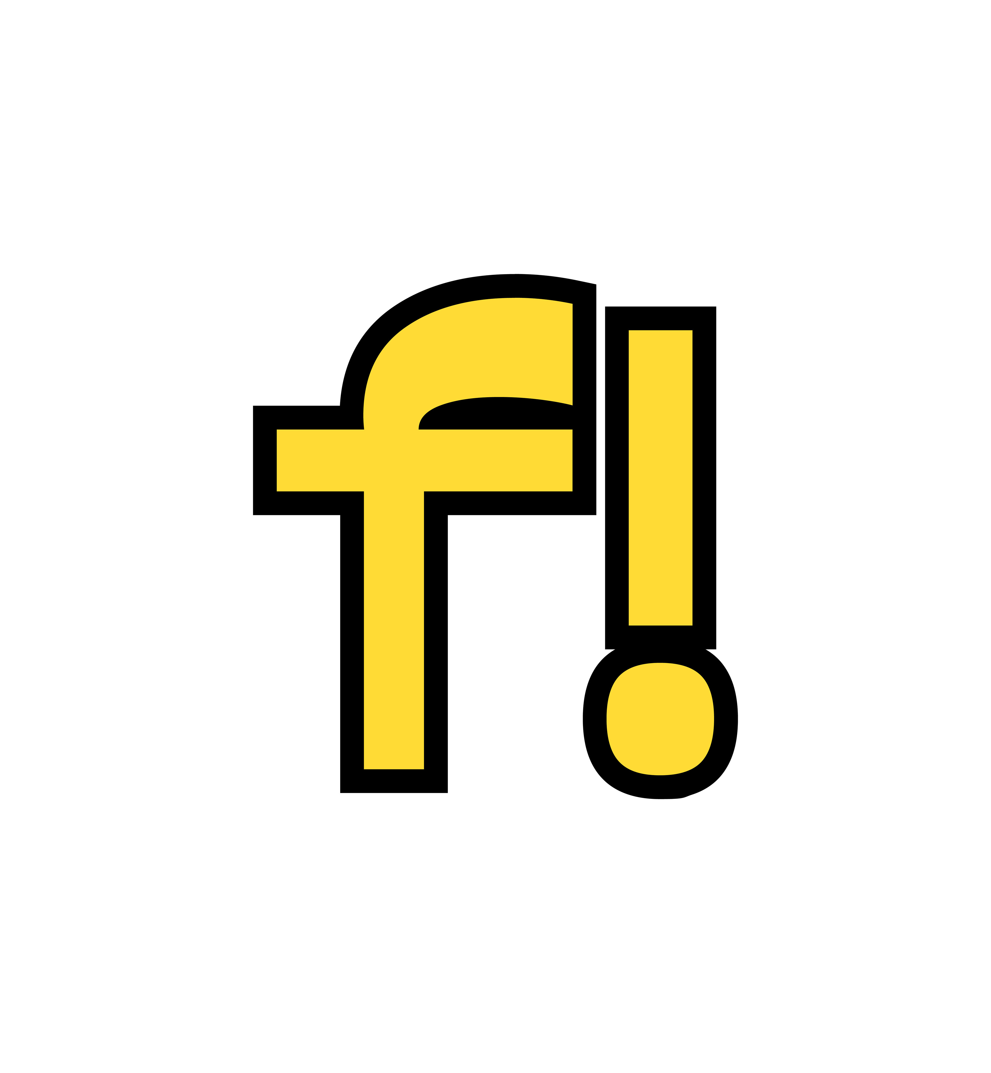
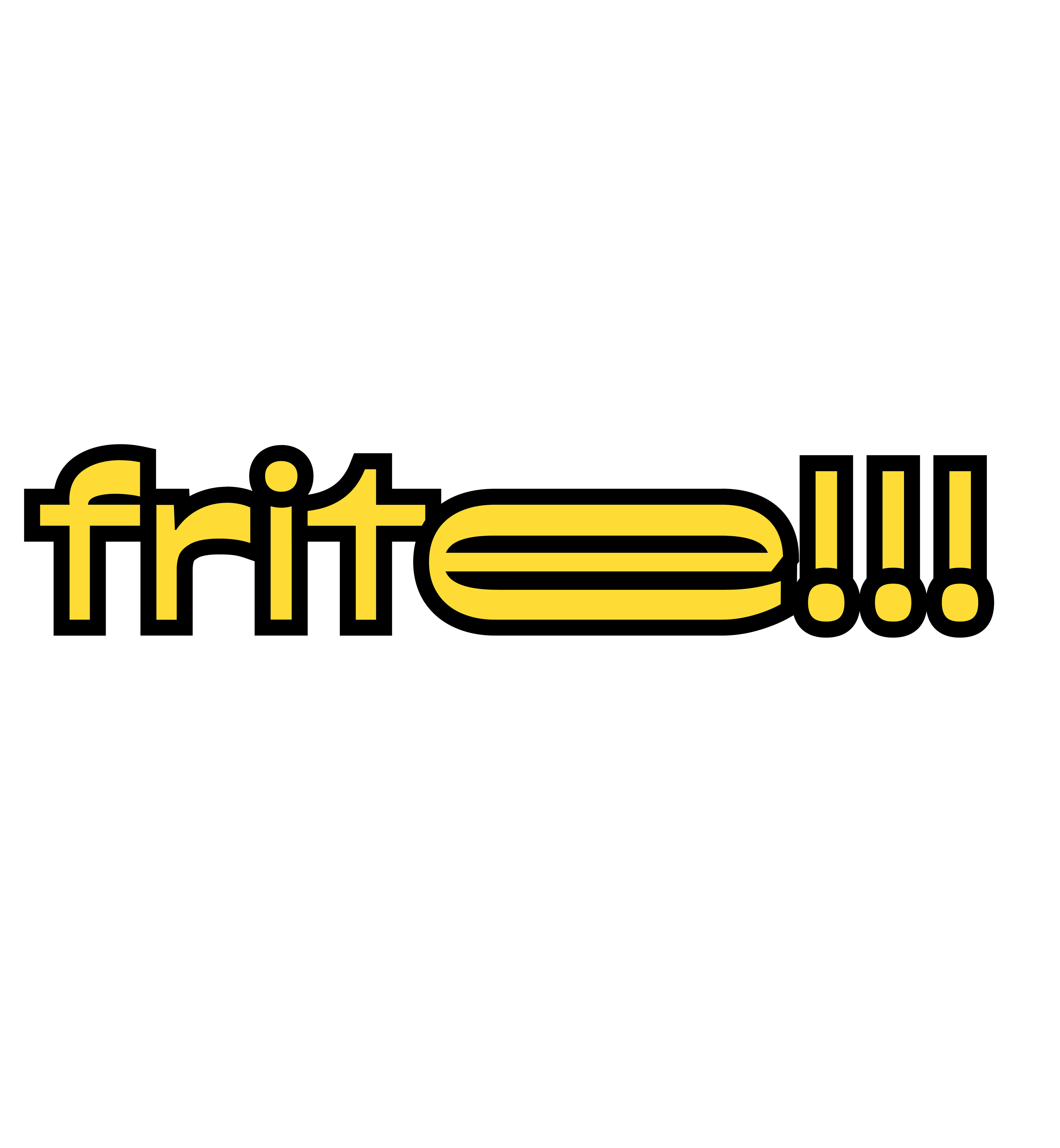
Logos variations of the festival.
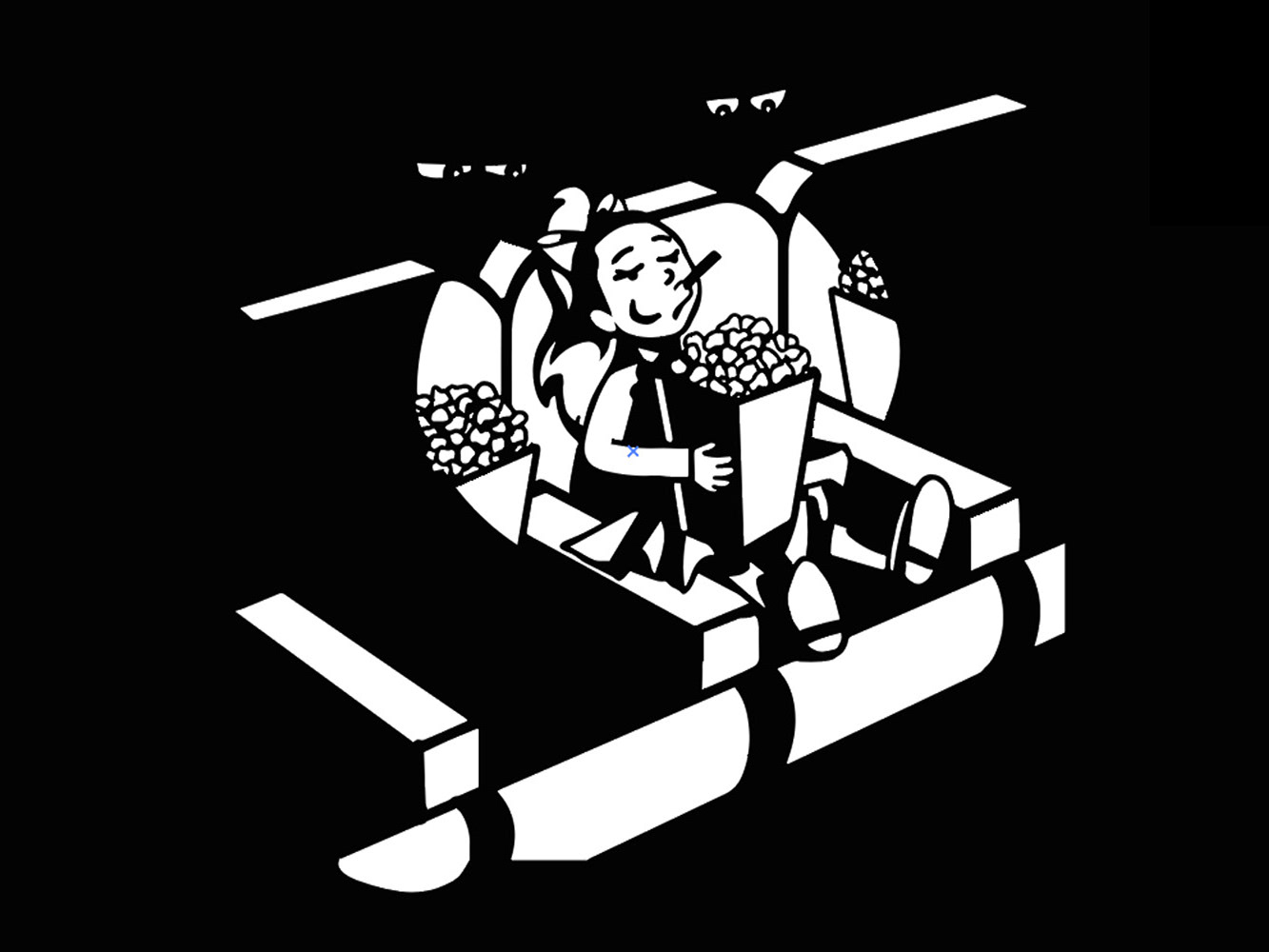
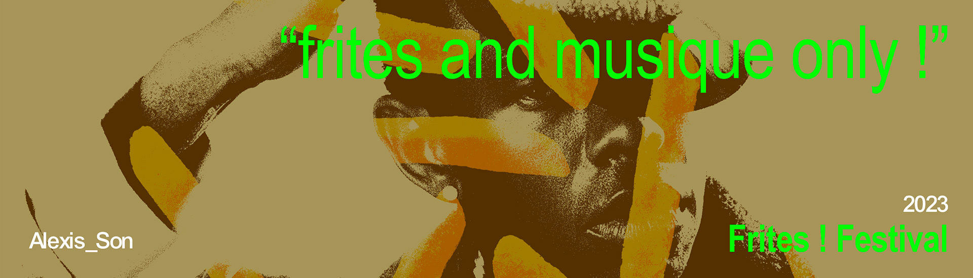
Then, I took some elements like fries and gradients, and I photoshopped everything using post-production in Photoshop, applying grain, duotone, and curves to create textured graphic elements that fit the festival's art direction (looks like grunge).
To give a relaxed yet serious image, I wanted to add renowned influencers and chefs to the guest lineup, as well as artists from the scene well known for their music and image defined as carefree, even "nerdy", suche as steve lacy, thundercat, or diego alary, whoogys... I wanted people to enjoy their favorite fries while listening to music that complemented the culinary experience.
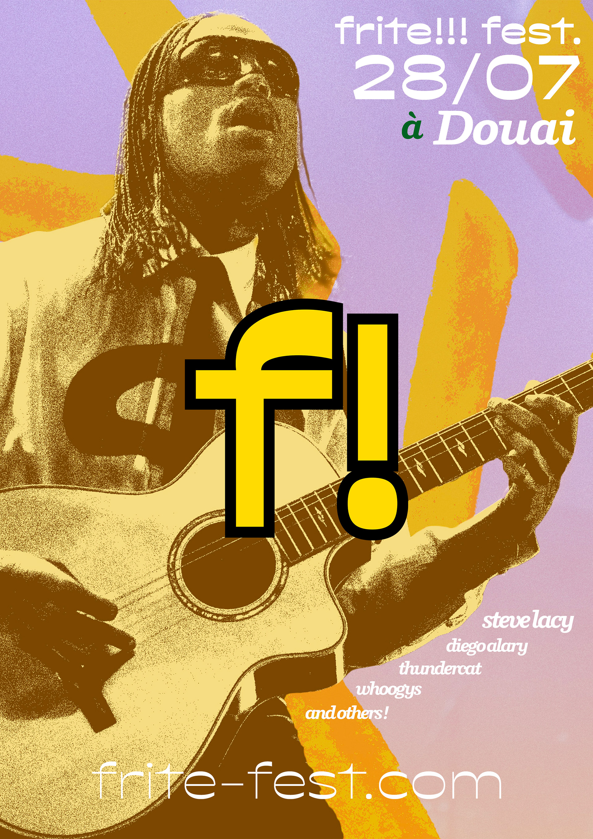
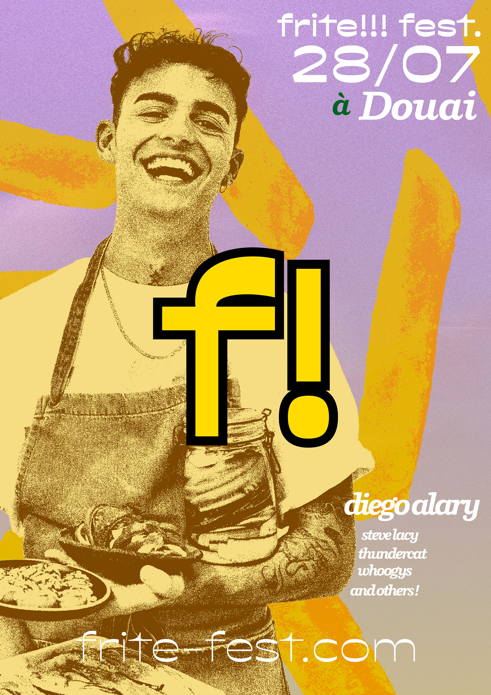
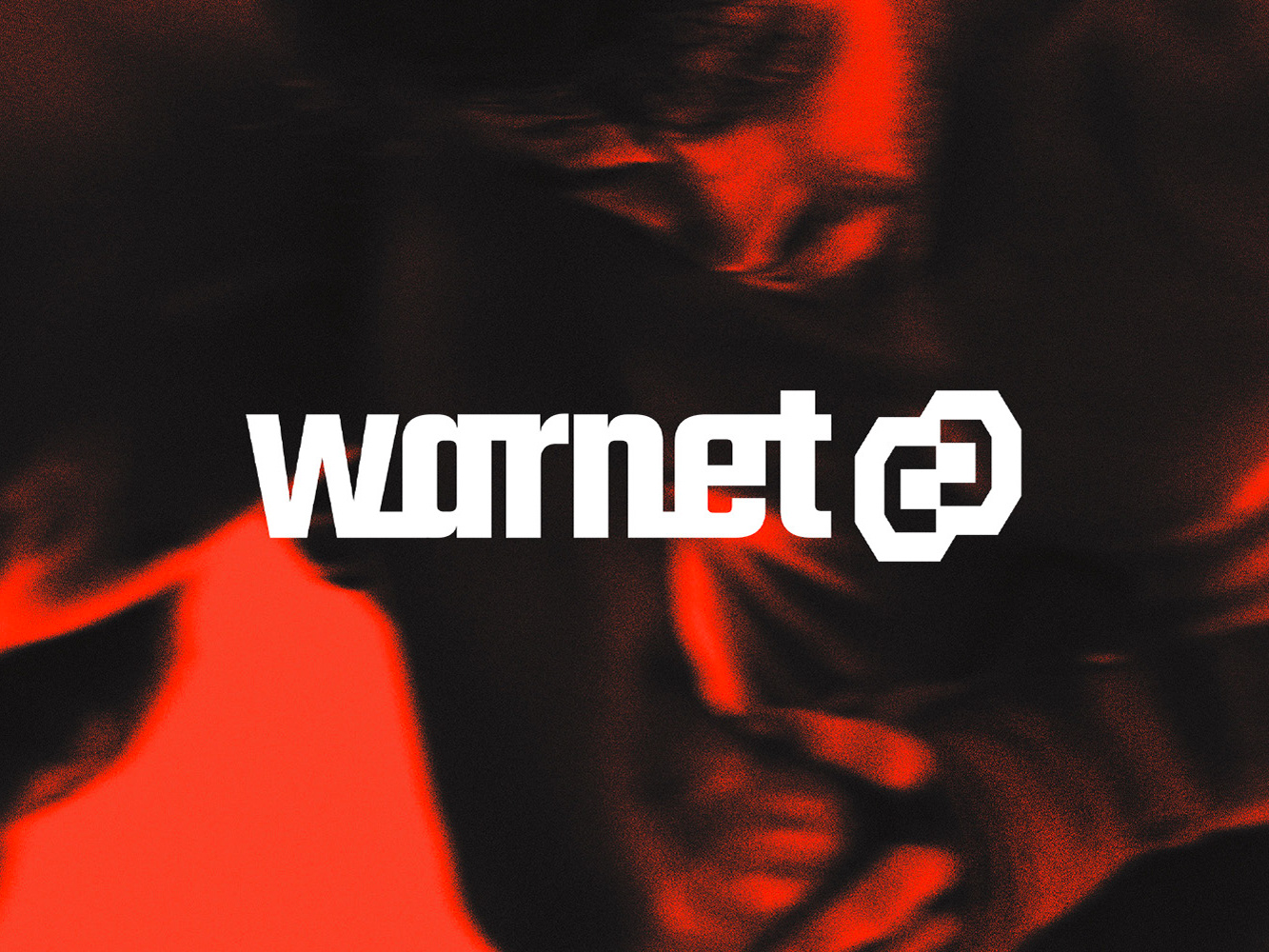
A2 format ads for the frites! festival.
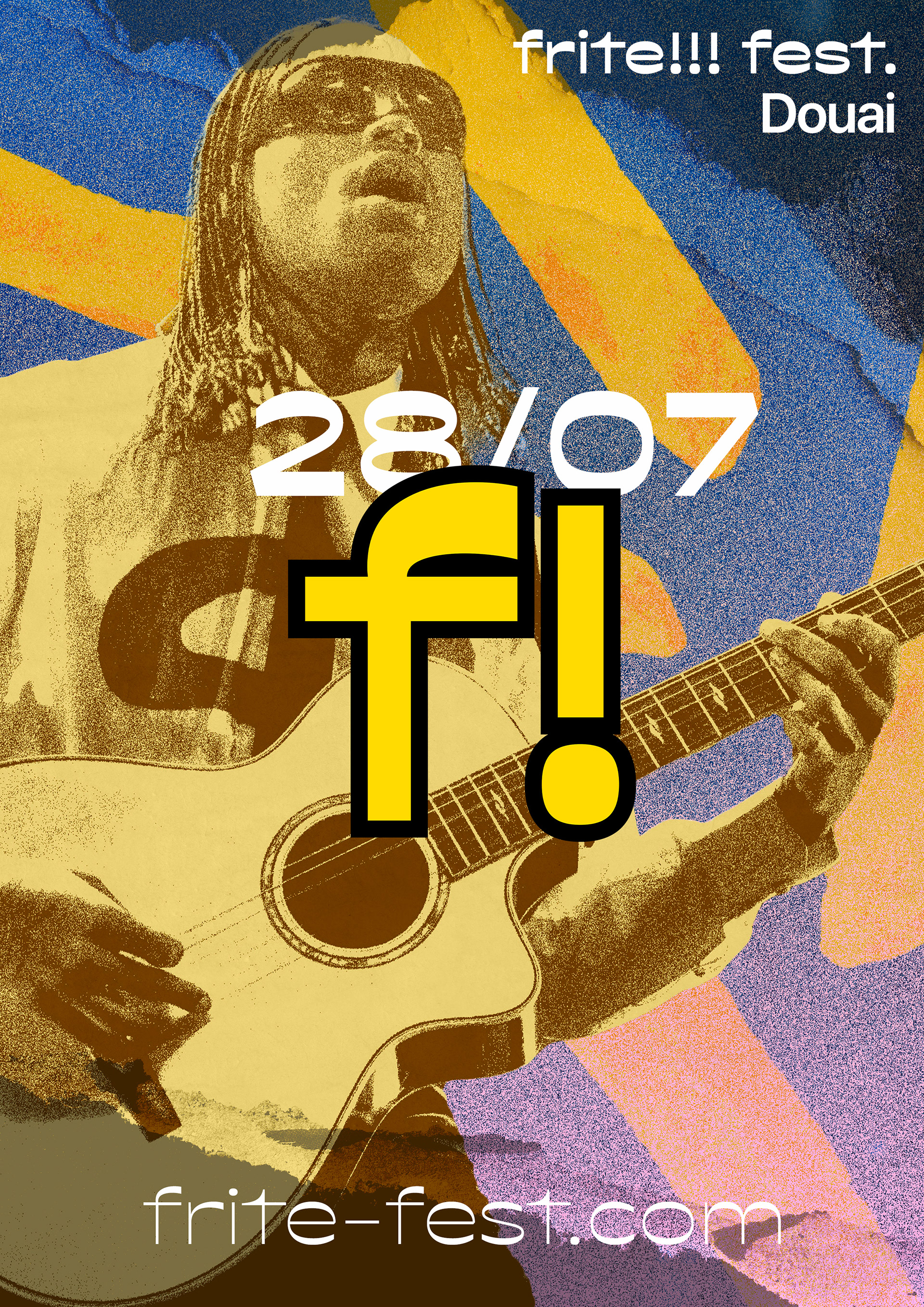
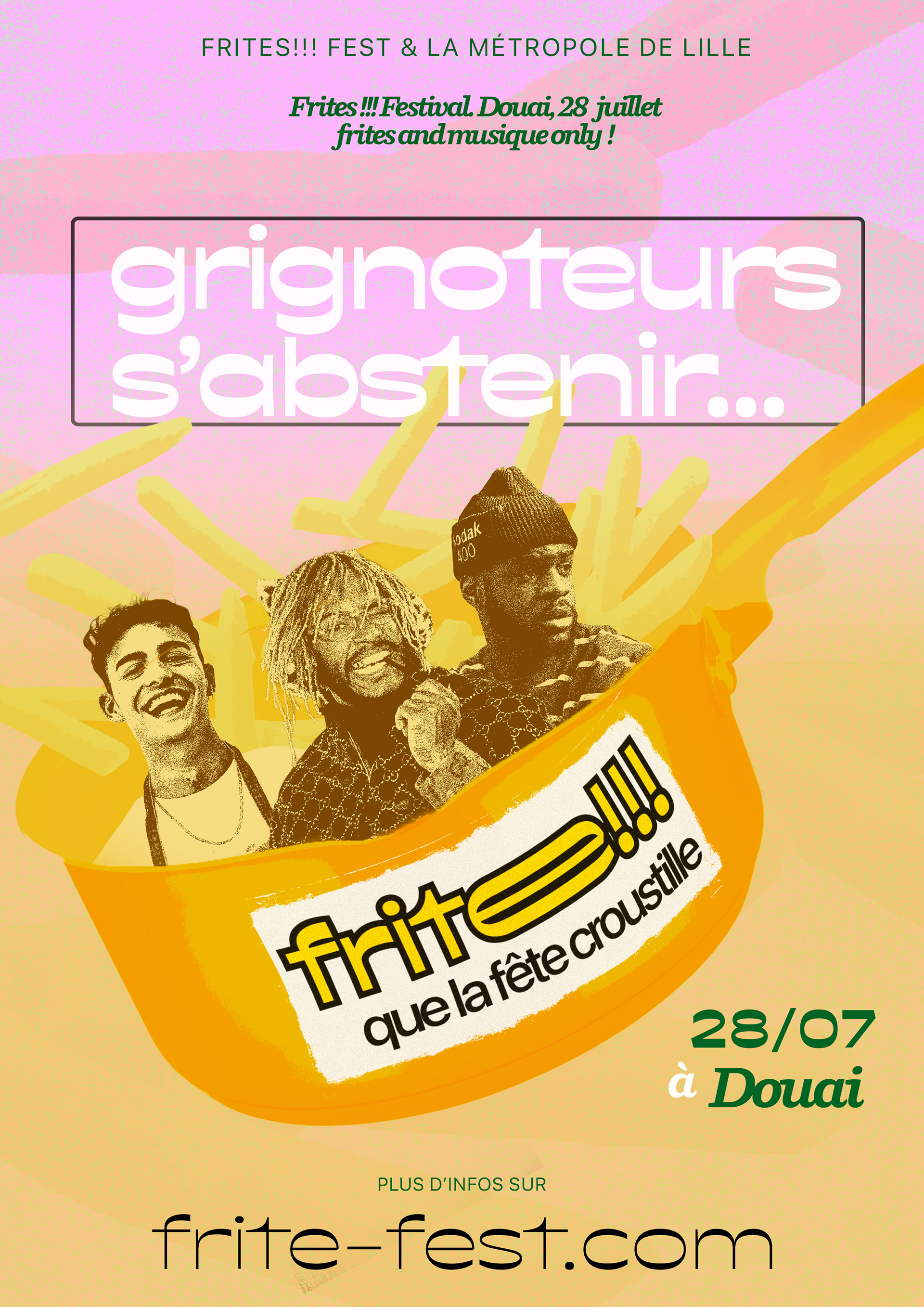
Another example on A2 print format.
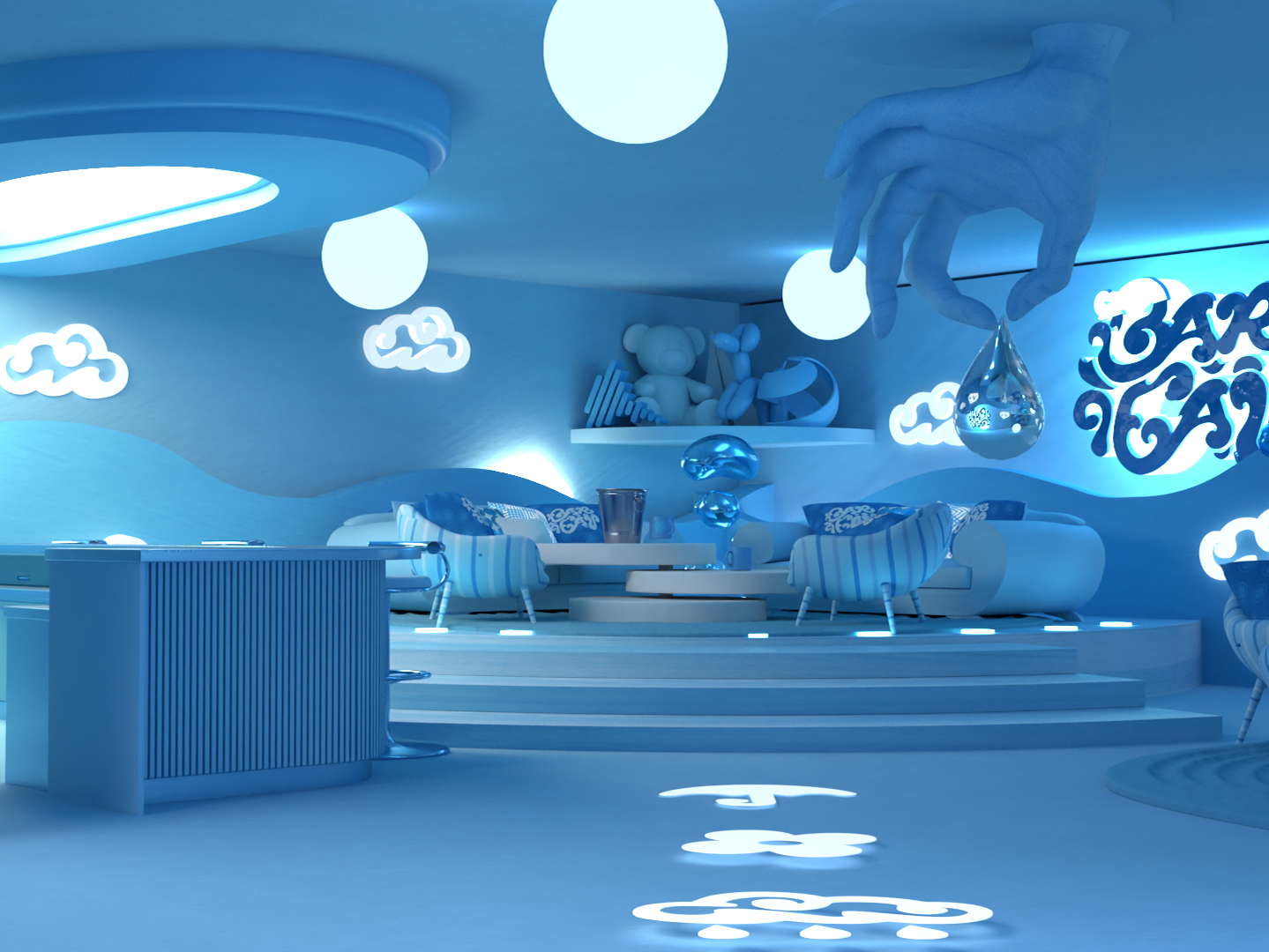
Quick landing page of the festival.